
Quality Assurance Image Library
This is my carefully curated collection of Slack images, designed to perfectly capture those unique QA moments. Whether it's celebrating a successful test run, expressing the frustration of debugging, or simply adding humor to your team's chat, these images are here to help you communicate with personality and style.
Test as you fly, fly as you test
---
"Test as you fly, fly as you test" emphasizes the importance of continuous testing in software development. Rather than being considered a separate phase, testing should be an ongoing activity that is integrated into the development process. This approach is also known as "Shift Left" testing.
In "Test as you fly, fly as you test" the first part "Test as you fly" implies that testing should begin early in the development process, ideally, as soon as the first lines of code are written. Developers can then catch and fix defects as soon as they occur, saving time and resources in the future.
The second part of the phrase "Fly as you test" means that the software should be deployed and used in a real-world environment as soon as possible. The developer can then identify and fix issues that may not have been discovered during testing in a simulated environment, such as scalability, compatibility, and security.
Incorporating testing into the development process allows development and testing to be carried out in parallel, improving the speed, quality, and efficiency of software development.
In summary, this phrase aids the development team in catching defects as early as possible and validating the feature under real conditions.
![]() Filed under the Quality Assurance category. [Permalink]
Filed under the Quality Assurance category. [Permalink]
Setting QA Goals
Quality assurance (QA) goals are objectives that a QA team or organization sets in order to ensure that the products or services they provide meet certain standards of quality. These goals may be specific to a particular project or product, or they may be more general and apply to the QA team's overall approach to quality assurance. Some common QA goals include:

- Ensuring that products or services meet or exceed customer expectations.
- Identifying and addressing potential defects or issues in a timely manner.
- Implementing effective testing and quality control processes to prevent defects from occurring in the first place.
- Ensuring that products or services are released on time and within budget.
- Continuously improving the QA team's processes and procedures in order to increase efficiency and effectiveness.
- Providing comprehensive and accurate documentation for all products and services.
- Developing and maintaining strong relationships with other teams and stakeholders within the organization.
- Providing a positive customer experience through excellent customer service and support. Overall, the goal of quality assurance is to ensure that products and services are of the highest possible quality and that they meet the needs and expectations of customers and other stakeholders.
![]() Filed under the Quality Assurance category. [Permalink]
Filed under the Quality Assurance category. [Permalink]
Best QA Blog post of 2022
These are the five favorite Tuesday Blog posts of 2022. I started the year with QA and switch in the summer to some PDF documents:
- April, 2022 - XPath Validation - Works in Chrome and FireFox
- March, 2022 - QA Snagit Stamps - Stamps to Show Testing Location
- August, 2022 - An Overview of Apple Products - Choosing the system that's right for you.
- February, 2022 - PyTest Install - Alternative way to install PyTest
- May 2022 - Release Engineer Queue Boss - Having a Skill Engineer Available can Help the Release Deployment
![]() Filed under the Quality Assurance category. [Permalink]
Filed under the Quality Assurance category. [Permalink]
QA Task List
A quality assurance (QA) task wish list is a list of tasks and activities that a QA team or individual would like to prioritize or work on in order to improve the quality of a product or service. Here are some examples of tasks that might be included on a QA task wish list:
- Conducting automated and manual testing to identify and fix defects in the product or service.
- Collaborating with developers to troubleshoot and resolve issues.
- Implementing new testing tools and processes to improve efficiency and effectiveness.
- Developing and maintaining test plans, test cases, and other testing documentation.
- Setting up and maintaining test environments to replicate real-world conditions.
- Reviewing and analyzing performance and reliability metrics to identify potential issues.
- Participating in design and code reviews to ensure that quality is built into the product from the beginning.
- Providing feedback to developers and other stakeholders on the quality of the product or service.
- Training and mentoring other team members on testing best practices and techniques.
- Staying up-to-date on industry trends and emerging technologies related to quality assurance.
![]() Filed under the Quality Assurance category. [Permalink]
Filed under the Quality Assurance category. [Permalink]
Falsifiability

Falsifiability is not directly related to quality assurance testing. Quality assurance testing is a process used to ensure that a product or service meets certain standards of quality and meets the needs and expectations of customers or users. This is typically done through a variety of testing methods and techniques, such as unit testing, integration testing, and acceptance testing.
Falsifiability, on the other hand, is a concept in the philosophy of science that refers to the ability of a hypothesis or theory to be tested and potentially proved false through observation and experimentation. This concept is not typically applied to quality assurance testing, as the focus of QA testing is on identifying and addressing defects or issues in a product or service, rather than on testing scientific theories.
However, it is possible to apply the concept of falsifiability to QA testing in a more general sense. For example, if a QA team sets a hypothesis that a particular product or feature will meet certain quality standards, they can then design and conduct tests to either confirm or falsify that hypothesis. If the tests show that the product or feature does not meet the specified quality standards, the QA team can then work to address the issues and improve the quality of the product or feature. In this way, the concept of falsifiability can be used to help QA teams identify and address potential defects or issues in a product or service.
The main benefit of using Falsifiability QA testing is that it helps to reduce risk by identifying potential issues early on in the development process, allowing them to be addressed quickly and efficiently before they become major problems down the line. Additionally, this type of testing can help improve user experience by reducing errors or unexpected behaviors from occurring during use which could lead to frustration or confusion among end-users. Furthermore, conducting regular tests throughout different stages allows developers to track progress more accurately while also providing feedback about changes made along each step so further improvements can be made if necessary for better performance overall.
Overall, investing time into proper Falsifiability QA Testing pays off significantly when it comes time for launch day since it reduces risks associated with releasing products with unknown flaws due unforeseen circumstances not previously identified during development phases . By having thorough checks conducted regularly throughout all stages , companies are able ensure their products meet standards set forth while also guaranteeing customer satisfaction upon release .
![]() Filed under the Quality Assurance category. [Permalink]
Filed under the Quality Assurance category. [Permalink]
QA Tester Image
Artificial intelligence has become increasingly commonplace in recent years, as it can be used for a variety of purposes online, from content generation to image creation. While some may view AI with suspicion or even fear, there is no denying that it can be a powerful tool when used correctly. With the continued development of AI technology, it is likely that we will see even more amazing and useful applications for it in the future.
Fotor's Photo Editor Now Uses AI for Quick, Easy Image creation
If you're looking for a quick and easy way to edit your photos, you'll want to check out Fotor's new AI-powered photo editor. Simply type in a word or phrase and in a few seconds, you get an AI image.
This is a great tool for those who don't have the time or patience to learn complex editing software. And best of all, it's free! So why not give it a try?
Quality Assurance Tester
I decided to see what AI thinks a Quality Assurance Tester is. Here are the results:

Slack Icon
If you like that image, feel free to use this "ready for Slack" version.
![]() Filed under the Quality Assurance category. [Permalink]
Filed under the Quality Assurance category. [Permalink]
November Release Memes
Various QA Memes announcing the release in the month of December.
Be sure to check out all the QA Memes in the cryan.com QA Library.

https://www.cryan.com/qa/graphics//ChristmasBellReleaseDay.webp

https://www.cryan.com/qa/graphics//ReleaseDayGold.webp

https://www.cryan.com/qa/graphics//HappyReleaseDayGift.webp
![]() Filed under the Quality Assurance category. [Permalink]
Filed under the Quality Assurance category. [Permalink]
QA Poems
Keeping the content light this week, here's some original QA Poem/Songs:
Fired Up!
I'm on my way to work
I'm getting ready for the day
I'm thinking about my quality assurance
How I'm going to make sure that everything is perfect
I need to make sure that everything is just right
That there's no room for error
So I will be working extra hard today
To make sure that everything is just right
QA Is Important Song
Quality assurance is so important
It keeps the product high quality
It's what makes the customer happy
So we always make sure that we're perfect
We always make sure that we meet their needs
We always make sure that they're satisfied
Quality assurance is so important
It keeps the product high quality
It's what makes the customer happy
So we always make sure that we're perfect
We always make sure that we meet their needs
We always make sure that they're satisfied
![]() Filed under the Quality Assurance category. [Permalink]
Filed under the Quality Assurance category. [Permalink]
Quality Assurance Management Tasks
The quality assurance manager has a lot of responsibilities that he or she needs to carry out on a regular basis if they want to maintain the quality of the products and services that they provide to their customers. Here are some of the most important ones:
QA Manager Responsibilities
1. Establish quality standards and procedures. This is the foundation of your quality assurance system and it needs to be well-defined and documented. Without this, it will be difficult to measure and improve the quality of your outputs.
2. Train employees on Quality Assurance procedures. All employees need to be aware of the importance of following established procedures in order to achieve consistent results. Make sure they understand what is expected of them and give them feedback regularly so they can see how their performance is impacting overall product quality..
3. Conduct audits regularly.. Audits help you identify areas where improvements are needed so that you can make necessary changes. They also provide valuable insights into how well your employees are following established procedures. Schedule audits on a regular basis ( at least once per quarter)
4 Monitor customer feedback closely. Pay attention to both positive and negative feedback from customers as it can help you identify potential problems early on. Use this information to make necessary adjustments to your processes or products.
![]() Filed under the Quality Assurance category. [Permalink]
Filed under the Quality Assurance category. [Permalink]
Applescript for Chrome
The following is a quick AppleScript that I created to add the URL of the current page to the clipboard. This has the advantage of creating a simple, easy-to-read URL in markdown format, which I can then copy and paste into Slack or an email.
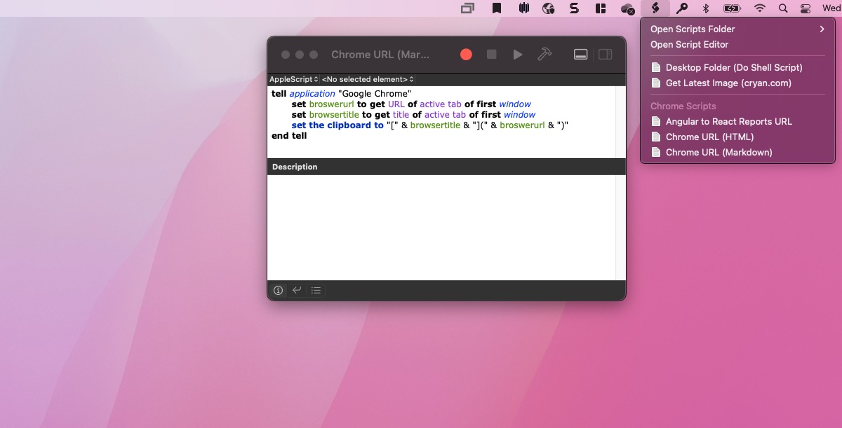
If you would like to copy/paste the raw code, here it is.
tell application "Google Chrome"
	set broswerurl to get URL of active tab of first window
	set browsertitle to get title of active tab of first window
	set the clipboard to "[" & browsertitle & "](" & broswerurl & ")"
end tell
![]() Filed under the Quality Assurance category. [Permalink]
Filed under the Quality Assurance category. [Permalink]
About
Welcome to QA!
The purpose of these blog posts is to provide comprehensive insights into Software Quality Assurance testing, addressing everything you ever wanted to know but were afraid to ask.
These posts will cover topics such as the fundamentals of Software Quality Assurance testing, creating test plans, designing test cases, and developing automated tests. Additionally, they will explore best practices for testing and offer tips and tricks to make the process more efficient and effective
Check out all the Blog Posts.
Blog Schedule
| Saturday | Internet Tools |
| Sunday | Open Topic |
| Monday | Media Monday |
| Tuesday | QA |
| Wednesday | Veed |
| Thursday | Business |
| Friday | Macintosh |
Other Posts
- QA Fail: Boston.com Headline graphic
- Engineer Sayings
- Human Testing better than Automation
- Paul Revere rules of Quality Assurance Testing
- Early Evaluation
- QA Fail: Product Listing on Amazon
- Pet Testing
- Excellent MEME Images
- QA Snagit Stamps
- Slack Emoji Icons for QA
- CodeCopy
- QA Meme Collection
- Google Lighthouse
- Automation is Not
- Ask QA: Should You Always Report Bugs?