
Factors to Consider When Creating a Mobile SEO Strategy
Creating a mobile SEO strategy.

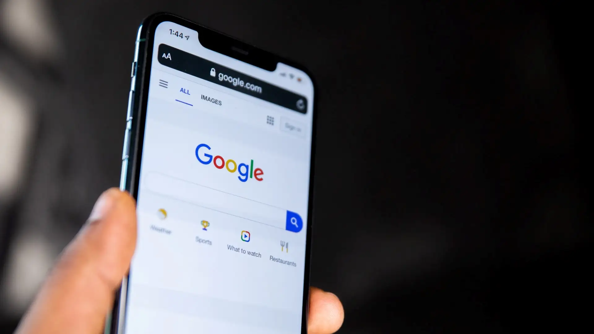
Mobile SEO refers to the practice of combining search engine optimization with responsive design in such a way that the site's text and visuals can be viewed in an optimal manner on handheld devices. This type of SEO can produce a fantastic consumer experience if you can execute it properly. Sites that adhere to mobile-first SEO strategies look great on any device, regardless of the size of the display they are viewed on. However, mobile SEO can be quite complicated if you have never done it. Therefore, if you are looking for a way to make your website look better and run more smoothly on mobile devices, here are some factors to consider when creating a mobile SEO strategy.
Why Is Mobile SEO So Important?
The number of active handheld devices in the country has increased dramatically over the years, and this trend is expected to continue. This is not surprising. The smartphone has become an essential part of people's daily lives and the primary channel through which businesses can promote and, more importantly, build relationships with the public. This is without even mentioning how big social media is. It means that the focus of SEO will increasingly shift from the desktop to the smartphone. In fact, Google's mobile-first index is already laying the groundwork for this to occur.
To create a mobile SEO strategy, you need to understand how different desktop and handheld users are.
Because of this social landscape, many businesses have modified their strategies to meet the needs of this new customer. However, most companies attempt to do so without understanding the fundamental differences between handheld and desktop users. We're not just referring to the fact that the screen sizes differ. Customers also approach the two distinct forms psychologically. For example, when it comes to PPC, the same rules don't apply between the two groups. Smartphone users are much more impatient; they are not confined to their homes and can leave whenever they want. Only if you understand the differences will you be able to plan your approach to mobile SEO accordingly.
Your Website Needs To Load Quickly
The loading speed of your website is a critical aspect of the mobile experience. Even more so than on desktop. When people look for information on the move, they want it quickly. If your website does not load quickly, they will leave. Therefore, the best thing you can do to retain leads on your mobile site is to enhance its load speed. If you don't know how fast your website is loading, you can find many useful tools on Google that offer you some insight. You may use these tools to determine where your site performs well and where it needs to improve. In mobile SEO, loading speed is essential. However, if you want to keep the load speed of your website quick, some of the things that you can do are:
- Reduce the number of redirects that you have
- Keep the design simple
- Avoid using uncompressed images at all costs.

Mobile users will not wait long for your page to load before leaving.
It's possible to hire a digital marketing firm to handle your mobile site's page speed optimization if you don't know much about coding or don't have the time. This is great because it will allow you to focus on running your business instead of worrying about the technical aspects of it.
It Needs To Have a Responsive Design
A mobile-friendly website requires responsive design. When you employ responsive design, you guarantee that your website adjusts to whatever device a user is on. When we are talking about mobile devices, we are not just talking about smartphones. You will need to ensure that the viewers get the optimal mobile experience, whether it's a smartphone or tablet. Integrating responsive design makes it easier for your audience to navigate your site.
If you don't do this, you could find yourself in a situation where your website looks great on some devices while it is crammed and illegible on others. Forcing your viewers to constantly zoom in and out to see your website's content will increase your bounce rate. If you don't want this to happen, you need to make sure that you have a responsive design for a wide range of screen sizes, not just the regular 5.5-7.1 inch smartphone displays.
Create Material With a Focus on Mobile Readability
As we've already mentioned, visitors should not have to pinch-zoom, squint, or do anything else to read the material on your mobile web page. If they have to do it, most of them will leave. There is nothing worse for your mobile SEO than having visitors leave because of such a simple and easily correctable error. However, many small businesses make this mistake when developing a website. Therefore, examine your website's content using a handheld device to see how it reads.

It is critical to ensure that your content is readable when creating a mobile SEO strategy; otherwise, your visitors will not want to read it.
If you want to ensure that your mobile website is easy to read, try to keep paragraphs short. This allows your readers to read your content in small doses. It also allows them to take their gaze away from the device and check their surroundings without losing track of what they are reading. You should also use a 14px font because it is easy to read on a small screen. In addition to that, make sure your text and background have a lot of contrast to make it easier for mobile viewers to see your material outside.
Conclusion
Utilizing every one of the strategies, tools, and configurations we have discussed up until this point should be a part of your effort to optimize your mobile website for search engines. However, it is crucial to remember that Google continues to emphasize the information above all other factors. Therefore, don't just ignore the quality of the content you produce. If you can create engaging content while also incorporating everything else we've discussed today, your mobile SEO will benefit greatly. With that said, hopefully, now you know what factors to consider when creating a mobile SEO strategy and how best to implement them in the future.
Meta Description: If you want to improve your rank on Google, here are some of the factors to consider when creating a mobile SEO strategy.