
Outdated Web Design Trends That You Need to Abandon
Seven Design Trends to Abandon Now

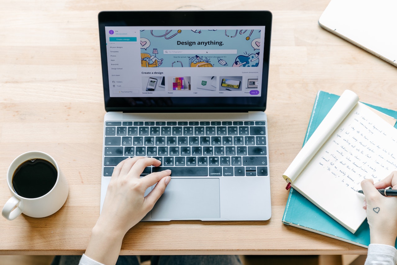
Is your website looking a little dated? A terrible website is one of the easiest ways to destroy a potential customer's interest in your business. Most visitors won't stick around for more than 15 seconds if your website looks like it was last updated in 2007. Too many companies still use obsolete, unappealing website design components and functionalities, which causes visitors to bounce before they even learn about what you're offering. If you find that you're using some of these, we urge you to ditch those outdated web design trends as soon as possible.
7 Outdated Web Design Trends That You Need to Abandon ASAP
Does a lot of traffic quickly leave your website? Are you unhappy with the number of monthly visitors you receive? It might be the antique design techniques you're using. Or the fact that you haven't changed a single thing in years. You might not notice, but cryan.com has been around since 1998. And, we have got plenty of chances to learn what our audience likes and what they find infuriating. Here are the seven outdated web design trends you need to abandon the first chance you get.
1. Aggressive Pop-Ups
It's doubtful that a visitor to your site is just killing time. They probably have some information-gathering mission in mind. We've all been there: you've finally found the website you've been looking for, only to have your browsing pleasure rudely interrupted by a window that claims to be from the site's owner. It's OK to seek user emails or other information, but there are more subtle methods than forcefully displaying a pop-up. Instead, you should include a subscription form on your site in a prominent location.

Any pop-ups, whether pop-up ads or the subscribe button, are annoying.
2. Too Much Design
Visitors will leave in droves if your website is poorly designed and too busy with content. They will go elsewhere if they cannot quickly and easily grasp the essence of your brand. Your company's identity, brand values, and the products and services you provide will be more effectively communicated with a clean, uncluttered design. The typical internet user lacks the patience to comb through irrelevant material to get what they need. They will leave your site immediately and visit a rival.
3. Ultra-minimalism
To understand why minimalism has become so widespread, you need only consider a few fundamental factors. Users get frustrated with too complex websites. Some programmers have been cramming as much information as possible into the designs for years. But when minimalism expanded too far, it bred monotony and sameness in appearance. With this goal in mind, designers have started using bold color palettes, asymmetrical layouts, and unconventional design approaches to grab the attention of their users.
Experts at wpfullcare.com are very against this method. You have to make your website recognizable at all costs. A super minimalistic approach just won't cut it. Your website will look too much like a thousand others. However, that does not mean you must give up on simplicity altogether. Still, a good structure and a non-distracting backdrop make information easier to take in. No matter the topic, whether it is how to boost your self-assurance at school or the top five detective books, the website in question should be straightforward. So, be sure to provide visitors with the information they need. Remember that people have come to you for knowledge; if you don't find it, they will go elsewhere.
4. Flash
Since the invention of HTML5, Flash has mostly been rendered obsolete. Flash used to be the most cutting-edge technology of its day. It allowed web designers to add moving images, music, and interactive features to their sites. But it also had a lot of problems, and the frustration for users has gotten even more intense. Plus, Flash is incompatible with mobile devices. But the biggest issue with Flash is that it slows down search engine optimization (SEO). And it also requires a plugin for the browser and is notoriously difficult to install, and has serious security concerns. After you're done reading this, we're sure you'll run to ditch these outdated web design trends. If you want some inspiration for your website's new design, feel free to get inspired at Dribble, where you can find some amazing ones.
5. Cheezy stock images
Using stock images is not necessarily wrong. Stock images are an excellent option for customers that lack the resources to produce their own business photographs. However, there was once a period when "poor" (read: very corny and unrealistic) stock images were the height of fashion. There is still a widespread presumption that a shot of two people shaking hands in a bright conference room indicates trust. So you'll see websites using this style of photo nowadays. But you'll be so wrong if you believe this. Sometimes, it's just better not to use pictures at all and add a random background generator to make your post look more attractive.

These cheesy stock photos are a prime example of outdated web design trends. Using your own images is better if you plan on including something like this.
6. A Never-Ending Scroll
An endless page with a list of items is advantageous if you manage an online business. However, this is not the case for an informative or business project. This page prevents users from accessing the footer, which includes valuable information and connections. Because of this, it is crucial to analyze user behavior; otherwise, how can you foresee their requirements?
7. Desktop Hamburger Menus
The "hamburger" menu on websites consists of three horizontal lines piled on top of one another and located to the right of the main navigation bar or menu. When a visitor clicks on one of these menus, a submenu appears, providing even more options for them to explore. This icon is great for mobile devices since it makes navigating a website's layout easier. On desktop PCs, however, the hamburger menu is more of a distraction than a help.
Save the "hamburger" menu for the mobile web.
The bigger display of the desktop version might make the hamburger menu a challenge. Many people would be surprised to see it appear on their desktops, and some may not know how to use it. Web visitors are far less inclined to look around if they have trouble navigating your site's design. When designing for a bigger screen, don't utilize the hamburger menu; instead, save it for mobile web design. Although this is not precisely one of the outdated web design trends, it's best used only for the mobile web.