
Apple Numbers (QA Fail)
Creating a simple chart in Apple Numbers is not so simple.

Apple makes things easy - which is why I like using it as my computer platform. Just about everything is easier to do on Macintosh.
However, they seriously failed with making graphs in Numbers.
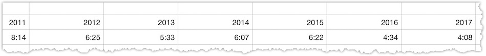
On Christmas Day, I was trying to create a chart of how early my daughter would wake up Christmas morning.
I was struggling with generating a chart from a bunch of data. Basically it was a spreadsheet that had years as one row and times in the second row.
Here's a sample shot of the data:
When I clicked on the "Insert Chart", this is what I got:
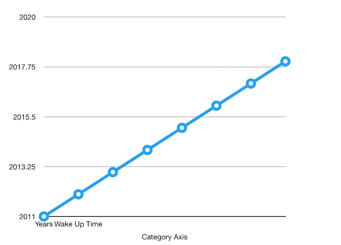
Looks like I'll have to do a lot of chart manipulation to make this to work. (I tried putting the data via column view and got the same results.)
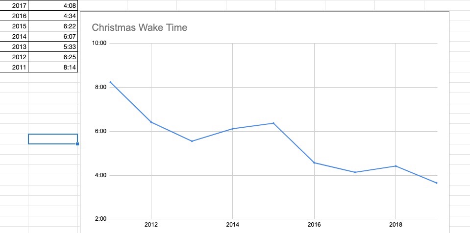
Google Sheets
I put in the exact same data in a Google SpreadSheet, select the fields and clicked "Insert Chart" and got a perfectly matched chart:
What I Learned
Apparently if I need to create a quick chart, the way to go is to use Google Spreadsheet (or Excel). Apple Numbers isn't all that user-friendly when it comes to creating charts.
Apple should make it simple to create charts - they do have some unique layouts/styles that aren't available in other applications. I shouldn't have to be a chart master to make it work - especially if the data is simple.